Hi everyone! I thought it might be fun to take a deeper look into Rebuild’s new art style and why we’ve made some of the decisions we’ve made so far. Just a quick heads up on who I am, My name’s Adam Meyer and I’m the lead artist on Rebuild: Gangs of Deadsville (Being Kickstarted now!). So if you love what you’ve seen so far, then thanks! If you don’t? Then tough luck! Haha, seriously though, there have been some concerns raised about the new art direction and it not being as gritty or as realistic as Rebuild 2. Completely valid complaints, but why did we go this route? I’m glad you asked! Here are a few reasons why we went with the more cartoony look that we ultimately settled on. Caution, made up words ahead.
1. Marketability: I know this one won’t be popular. But the truth is that to get this great game in even more hands, it needed to appeal to more casual users. Okay, now I got the tough one out of the way.
2. Visibility: Because the game is going to be on mobile phones it ‘s extremely important that you can quickly recognize what you’re looking at. Characters, buildings and interface all needed to have enough exaggeration in them that they would be nice and clear with the limited screen space. Realistic stuff tends to kind of blend together when scaled down.
3. Usability: At the end of the day, clean vector objects like this take up much less space than their raster cousins. So the game will download/install faster, and the graphics scale easily so they look just as good on different screen sizes.
4. Consistency: One of the things Sarah expressed as a concern when starting this project was the lack of consistency in Rebuild 2. You had these realistic characters, title screen, and interface. But the map was filled with these very cartoony buildings. So above all, everything had to match. I also felt like there was a lot of humor in the game. Dark humor maybe, but humor non the less. So that was probably my main reason for developing the look the way I did. It just felt to me that it was the style that was most consistent with what Sarah was writing.
5. Lovability? There are going to be hundreds of survivors in this game and every time you send one out to ransack the local All-Mart, we wanted you to fear for their lives. With this many characters you can imagine how they might all start looking the same if they were realistic. I mean most people have pretty similarly shaped heads. (I’m not looking at you Jay Leno!) Anyway we didn’t want you to come down with a case of face blindness so we decided to make the characters more iconic so you not only would know who was who, but you’d care about them in the process.
Now you know the reasons, let’s have some fun and compare apples to oranges. But first, a quick look at a few different rendering styles I tried out on the buildings.
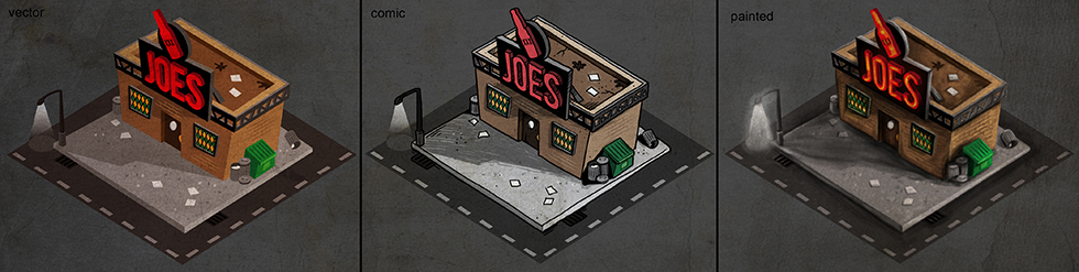
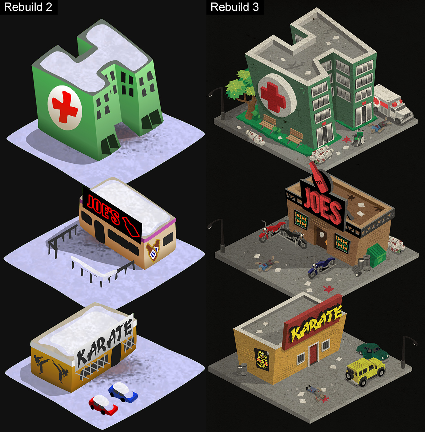
Here we can see that while most of the game is more cartoony that Rebuild 2, the buildings actually will be grittier and more detailed. Dead bodies, cracks in the buildings, broken windows, and generally more post apocalyptic looking.
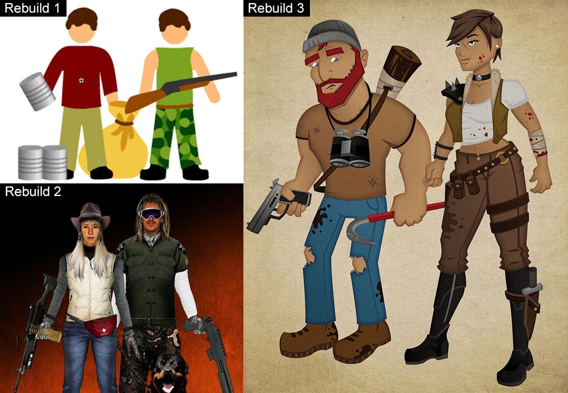
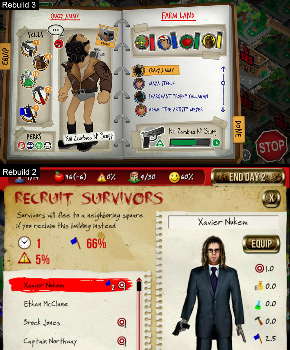
This image really shows how we tried to find a balance in the new character designs. Somewhere between the first game’s stick figures and the second one’s realistic characters. Just for some nostalgic fun you can check out Sarah’s original post about the new art style for Rebuild 2. I noticed alot of the comments in there preferred the originals more cartoony style. Haha. So we’ve come full circle now.
Interface comparison. It’s hard to tell in this pic, but the interface blends much better with the map this time around.
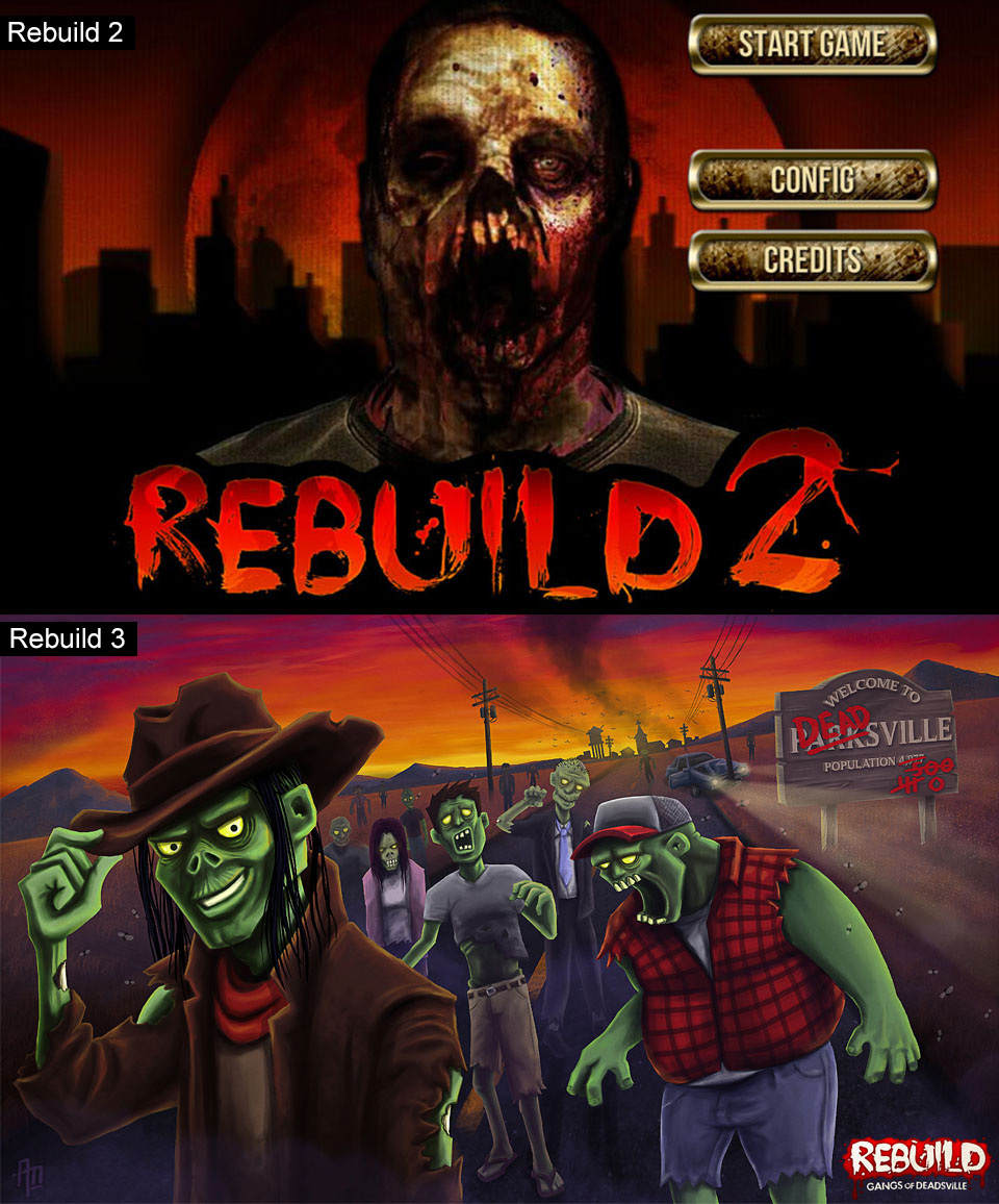
Even though we went a completely different artistic direction for the new game, I’m trying very hard to pull from the prior games. For example, the giant red moon and city in the background found it’s way into the new logo.
I hope you’ve enjoyed us pulling the curtain back on Rebuild’s new look. Thanks to everyone for your support!

These comparisons actually made me like the new style more than the old, while I used to doubt the new style (due to the cartoony people, didn’t notice how gritty the buildings look).
I think it’s really the title screen that sets it up as cartoony. You’ve got a green guy there, he’s not sick & suffering – he’s just a little dead and prefers the other white meat. And, is a bit more sentient than his companions.
A few things I really enjoy:
– It feels like the game really has an art-style. For all the gore, Rebuild 2 looks a bit pasted together. Well, at least in comparing the side-by-sides, I enjoyed R2 – so nice work!
– I love the window treatment on “Joe’s” *cough* Simpsons *cough*.
– I like there are more non-building elements (trees/cars), just a nice touch.
I really love the new art style. I love the extra detail on the buildings (windows on the hospitals, trees, bikes etc). R2 is one of my favourite games to play and replay so I am really looking forward to R3. Well done!