• Drawing a Trapezoid with Stage3d

    brokenGround

    The game I’m working on now has nice round corners that we surround with fuzzy grass or hard crystals or any number of pleasently tactile textures. Unfortunately until yesterday they were being drawn with horrible jaggy distortion (click on the image for a better view).

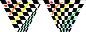
    This happens because I draw the circles out of trapezoids and the trapezoids out of triangles, and then the graphics card gets confused when it stretches the texture across the triangles. Here is a clear example of what it does look like vs. what it should look like:

    trapezoidBoth


    Obviously the one on the left is bad. It looks ridiculous at this scale and when you put it into the game it gives that jaggy broken look. It does show you clearly where the two triangles are, one on the top with a width of 400 pixels and one on the bottom with a width of 100 pixels. That width disparity is what drives the problem. I pass in UV texture coordinates for each point in each triangle but because the top triangle doesn’t know anything about the bottom right point it can’t know it’s being streched onto a trapedzoid so it just always assumes its being stretched onto a square.

    Important! If you are using OpenGL or a graphics library that uses 4d texture coordiantes then you have an easy fix for this as described here.

    Unfortunately Stage3d only has 2d texture coordinates so we have to fix it in the shader. Here is what a normal, shader might look like, one that results in a broken trapezoid:

    Vertex Shader:
    m44 vt0, va0, vc0
    mov v1, va2 
    mov op, vt0
    Pixel Shader:
    tex ft1, v1, fs0 <2d,linear,repeat,mipnearest>
    mov oc, ft1

    If you don’t know what this is then you can go read my posts on writing shaders for Stage3d.

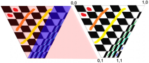
    Here is an image with some important information about our trapezoid. On right right is the texture coordiantes. It’s important to know that 0,0 is the top left and not the bottom left.
    trapezoidDetails

    The colourful image on the left is showing what shapes the graphics card is trying to texture. The bizarre slanting of the textures makes more sense if you think about what shape the triangle thinks it’s a part of. You can see the top triangle is trying to draw a big rhombus and the bottom triangle is trying to draw a much smaller one.

    If you think of it like this it becomes pretty clear that we just want to divide the x coordinate by 1-y coordinate. The top pixels are correct, and they get more wrong as they approach the bottom. Dividing them by 1-y will divide them by the range 1-0 which isn’t strictly correct unless the bottom trapezoid is zero length, but it’s much closer than what it’s doing now. Instead of the range 1-0 we really we want to divide by the range 1-.25 because the bottom is 100 pixels and top is 400 pixels. 100/400 = .25 and since it’s trying to draw a bottom that is 400 pixels wide multiplying by .25 will result in a 100 pixel bottom. (remember, since we’re working in UV coords bigger numbers result in the texture being squeezed more so if you want to decrease the  size you divide by .25 instead of multiply).

    Now we could do that with this pixel shader:

    mov ft2 v1 //v1 contains our UV coords
    mov ft3 v1 //ft3 will contain our modified y coord
    mul ft3 ft3 fc4 //multiply by 1-ratio of bottom to top. In this case fc4 contains .75
    sub ft3 fc1 ft3 //y = 1-y Now ft3.y contains values from 1 to .25 (fc1 contains 1)
    rcp ft3 ft3 //y = 1/y there is no divide operator so we multiply by the reciprocal
    mul ft2.x ft2.x ft3.y //do the real work
    tex ft1, ft2, fs0 <2d,linear,repeat,mipnearest> //sample the texture
    mov oc, ft1 //output
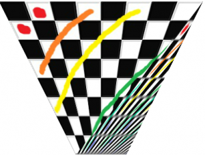
    inShaderWhich results in the image on the right. Pretty cool eh? The top triangle is now correct! Unfortunately the bottom one is fucked. Plus we got here by passing the bottom/top ratio through a shader constant which isn’t going to work with variable shaped trapezoids unless we draw them one triangle at a time. Which is not going to fly.

    So we need to generalise this to the bottom triangle as well as figure out a way to pass the shader the needed information. Obviously it’s time to fire up the VertexBuffers!

    First lets take a quick peek at how we’re passing in the points and the UV coordinates. Here is some code:

    triangles.push(new point(0, 0), new point(150, 300), new point(400, 0));
    triangles.push(new point(150, 300), new point(400, 0), new point(250, 300));
    for (var i:int = 0; i < triangles.length; i += 6) {
      mVertexData.setTexCoords(i, 0, 0);
      mVertexData.setTexCoords(i+1, 0, 1);
      mVertexData.setTexCoords(i+2, 1, 0);
      mVertexData.setTexCoords(i+3, 0, 1);
      mVertexData.setTexCoords(i+4, 1, 0);
      mVertexData.setTexCoords(i+5, 1, 1);
    }
    pointNum

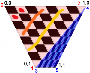
    On the right I’ve numbered our  points as well as reminded us all what the UV coords for those points are. The biggest thing we need to do now is to start passing the Bottom/Top ratio to the shader. We’re going to do that by passing them into the shader through a vertex buffer. I’m using Starling so I modified the starling VertexData class to hold my data but however you usually pass in your vertex buffer is cool. The important thing is that somewhere you have a line that looks kind of like this:

    context.setVertexBufferAt(1, mVertexBuffer, VertexData.PERSPECTIVE_OFFSET,    Context3DVertexBufferFormat.FLOAT_3);

    Note that I named the collection of variables I’m about to pass in Perspective variables. Because it’s kind of a perspective transform we’re doing.

    We could, at this point, just pass in Bottom/Top which would look something like this (remember, your mVertexData has no .setPerpectiveCoords, I added that):

    var w1:Number = mTriangles[i + 2].x - mTriangles[i].x
    var w2:Number = mTriangles[i + 5].x - mTriangles[i+3].x
    mVertexData.setPerpectiveCoords(i, w2/w1);

    But we can actually do better than that. We can do some of the math for the shader, which will be way faster than doing it for every pixel. Lets see what that looks like:

    //Set the UV coords
    mVertexData.setTexCoords(i, 0, 0);
    mVertexData.setTexCoords(i+1, 0, 1);
    mVertexData.setTexCoords(i+2, 1, 0);
    
    //prep our perspective vals. We want this to go from 1->.25
    var val0:Number = 0;
    var val1:Number = 1;
    val0 *= (w2/w1)-1; //0
    val1 *= (w2/w1)-1; //-.75
    
    val0 = val0 + 1; //1
    val1 = val1 + 1; //.25
    mVertexData.setPerpectiveCoords(i, 1, val0, 0);
    mVertexData.setPerpectiveCoords(i+1, 1, val1, 0);
    mVertexData.setPerpectiveCoords(i+2, 1, val0, 0);

    This is actually pretty clever. Remember that anything passed from the vertex shader to the pixel shader is linearly interpolated. We use that by passing in 1 to the top points and .25 to the bottom point and let the video card do the work for us. Unfortunately we can’t also do the divide because the graph of 1/x is not a linear graph and so the transformation gets effed. That means our shaders now look like this:

    Vertex:
    m44 vt0, va0, vc0
    mov v0, va1 //pass in our perpective data
    mov v1, va2 //pass in the UV Coords
    mov op, vt0
    Pixel:
    rcp ft3 v0 //y = 1/y
    mul ft2.xyzw v1.xyzw ft3.yxzw //multiply TexCoords.x by 1/y
    add ft2.x ft2.x v0.z //translate by some amount (we haven't discussed this yet)
    tex ft1, ft2, fs0 <2d,linear,repeat,mipnearest> //grab the pixel
    mov oc, ft1 //out

    Magic! Our top triangle is now tops! Time to move on to the bottom one. The only tricky think about the bottom one is that its x and y coords are the reverse of what we want. The top one was easy because 0,0 was always correct but for the bottom triangle 1,1 is always correct and 0,0 is the most wrong. The solution? Pass in the UV coords upsidedown! Do the math on the upsidedown coords and then flip them back.

    Here is what that looks like:

    //Old UV coords
    //mVertexData.setTexCoords(i+3, 0, 1);
    //mVertexData.setTexCoords(i+4, 1, 0);
    //mVertexData.setTexCoords(i+5, 1, 1);*/
    //fliped Coords
    mVertexData.setTexCoords(i+3, 1, 0);
    mVertexData.setTexCoords(i+4, 0, 1);
    mVertexData.setTexCoords(i + 5, 0, 0);
    
    
    val0 = 0;
    val1 = 1;
    val0 *= (w1/w2)-1; // w1/w2 instead of w2/w1
    val1 *= (w1/w2)-1;
    val0 = val0 + 1;
    val1 = val1 + 1;
    val0 = -val0; //Flip the sign so that when the x is multiplied by 1/y it will flip the sign of x
    val1 = -val1;
    mVertexData.setPerpectiveCoords(i+3, -1, val0, 1);
    mVertexData.setPerpectiveCoords(i+4, -1, val1, 1);
    mVertexData.setPerpectiveCoords(i+5, -1, val0, 1);

    Note -1 in the perpective coords. If you go back and look at the pixel shader you will see we multiply the y value by perspectiveCoords.x. By passing in -1 we flip the y axis. We flip the x axis by passing in a negative perspectiveCoords.y value.

    ALMOST DONE!

    The bottom triangle is fixed and this works for arbitrarily shaped trapezoids. The only problem is that it only works for texture coords from 0 to 1. But in real life our texture coords are usually things like 4.5 to 4.8 or 2.2 to 5.8 (in my application the y is always 0 to 1 though). That’s what this shader line is about:

    add ft2.x ft2.x v0.z //translate by some amount (we haven't discussed this yet)

    We just do all our math from 0 and then add back however much we want. If you look at these lines:

    mVertexData.setPerpectiveCoords(i+5, -1, val0, 1);

    And replace the , 1); with , 4.5); or , 2.2); or whatever texture coord you want you will get your desired translation. To set your desired width you just pass the width in to the UV coords as usual:

    mVertexData.setTexCoords(i, 0, 0);
    mVertexData.setTexCoords(i+1, 0, 1);
    mVertexData.setTexCoords(i+2, desiredLength, 0);

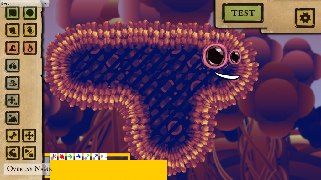
    Now we really are truly finished and we are rewarded by beautiful globby circular level layouts like this:
    final

    Callooh! Callay!
  • Spelunky + Game Designers = <3?

    I was watching this video by Rev3Games hosted by Anthony Carboni this morning , at the beginning of the interview Anthony suggests that game designers tend to love Spelunky more than other people. I don’t know if this is true but I have a theory about why it might be.

    Games are inherently about getting better, progressing towards mastery and there are two ways for games to give you this feeling of mastery:

    1. Skill Mastery: give you systems that you can learn and improve at (i.e. improving your multitasking is Starcraft)
    2. Number Mastery: increase some number over time (i.e. increase your level in Final Fantasy)

    Games are almost always a combination of the two. The core of the game is something you can improve at and by improving you are able to increase some number that is a gauge of your skill. I think the less of a gamer someone is the more easily they confuse these two things. The most casual games have almost no skill mastery but strong number mastery systems (Farmville being an amazing example). The least casual games usually have number mastery very tightly coupled to skill mastery with Starcraft and Chess’ ladder systems topping the chart. Game designers, who think about games all the time, should be really good at distinguishing between these two things and that helps them like Spelunky, which has wonky number mastery.

    Spelunky is a hardcore skill mastery game. No matter how many times you play you always start the game naked as the first time you played. In the video above and in other places Derek talks about how Spelunky has a non-traditional difficulty curve: it starts very steep in the mines, gets even harder in the jungle and then eases out with the ice and the temple. But the rate at which people aproach skill mastery is the opposite, they start bad and then get better and better and better. This means the game’s number mastery system (getting to later levels) is telling you that you are improving very slowly even when you are improving very quickly. Even a future master of the game will spend a lot more time dying in the mines then they will ever spend in the late-game temple levels.

    The result of this is that the game is very frustrating to players who look to number mastery for their “I’m improving” fix (since improving at something is why games are fun) and less frustrating to players who “see past” the numbers and know that they are greatly improving their skills despite not being able to beat the first level.

    Does this mean that some people are better at self-gauging when they are improving at things than other people? Or that they trust their own sense of improvement over external indicators? Or that they value external indicators less? Probably a combination of all three. I would also wager that the more games you play the more true all of these things become. As time passes you play less and less for the numbers and more and more for the raw experience of playing and learning, of experiencing novel environments and learning to master them.

    So game designers, because we play a lot of games, probably like Spelunky more than people who have played less games. You could also argue that being in indie games self-selects people with a strong attraction to internal indicators over external ones. Making an indie game requires months or years of work with little clear, positive, external feedback. Meaning we have to be good at self-guaging when we are improving.

    It may be that all of these things make it easier for players like me to enjoy Spelunky, but I doubt that it makes Spelunky better for us. I think we would probably enjoy it just as much if the numbers reflected our growing skill more generously, and maybe all those people who find it “too hard” would realise that the game is just lying to them.

  • Rebuild 3: games you should play while you wait

    Rebuild 3 (ahem, I should get used to saying “Rebuild: Gangs of Deadsville”)… is going to be awhile. I’ve updated my release date to Spring 2014, which simultaneously feels forever away, and far too close. While you’re waiting, here are some similar games to play that have been a big inspiration for the Rebuild series and the new game.

    King of Dragon Pass

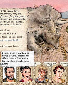
    inspiration_kingofI can’t believe I only just played this game from 1999, but I can tell you it still holds up. It’s a wonderfully rich storytelling experience, a strategy game where you manage a clan while being barraged with moral dilemmas. It’s set in a super deep fantasy world based on gods and mythology that goes on forever in such detail, all of it illustrated with these huge hand-drawn pictures. I’ve never played anything like it. It’s inspired me to make the text events in Rebuild 3 even longer with more explorations of the world and events from that terrible “first year” of the zombpocalypse.

    They more recently released an updated iOS version and have a great development blog for it. I highly recommend it to fans of strategy and storytelling.

    Dwarf Fortress

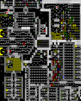
    inspiration_dwarffortressNow showing in the New York MoMA, this game is without a doubt a work of art. The product of years of obsession; Toady’s unrelenting drive to simulate the running of a dwarven city in raw and ridiculously minute detail. With ascii graphics. You need to squint and use your imagination to see the blonde/brunette/redhead, but part of the appeal is that the game is in your head. But to be honest… I prefer Mayday’s graphical edition, and though I know it’s sacrilege I’d kill for a full-mouse interface.

    Despite their lack of visual representation, those little dwarves have so much character that they inspire epic works of fanart/fiction. I come back to them when I’m brainstorming new survivor enhancements like perks, backstories, individual happiness, relationships, kids… it’s hard to know where to draw the line. With Dwarf Fortress there is no line since it’s a perpetual work in progress, which I guess in a way Rebuild has been too.

    SimCity

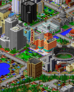
    inspiration_simcityThough not totally accurate, I sometimes describe Rebuild as “SimCity with zombies”, and my earliest prototype used modified building graphics from SimCity 1. Mostly because I needed some quick and recognizable placeholders, but also because the first two SimCities were defining games from my youth. I later played every other simulation game I could get my hands on, but these were my favorite.

    So I was heartbroken that the newest SimCity is riddled with always-online DRM which means I can’t reliably play in the remote places I live half the year. No surprise their servers didn’t handle the day 1 load, but it was inexcusable that EA claimed the always-online was to offload processing, which was a bald-faced lie. I’ve also heard the new game itself is a disappointment, but you can always go back and play the earlier games.

    Space Rangers

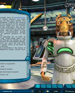
    inspiration_spacerangersRecently remastered as Space Rangers HD: A war apart, this space trading/piracy game breaks up the strategy with delightful interactive fiction events. Sound familiar? This game was on my mind when I came up with the initial concept for Rebuild: a strategy game broken up with text that tells a much deeper story.

    Rebuild 3’s going to have even more, longer events with more complicated decisions to make than just “yes” or “no”. They may not have you performing espionage at alien cocktail parties (a plotline I seem to recall…) but hopefully will be just as compelling.

  • Rebuild 3: Interfaces & common resolutions in 2013

    The target aspect ratio for Rebuild 3 is widescreen 16:9. Rebuild 1 and 2 were 4:3 which is pretty normal for Flash games that have to appear on sites like Kongregate with ads and stuff around them. But the PC/Mac and mobile versions of Rebuild 3 will support glorious fullscreen, where 16:9 is the new norm. Check it:

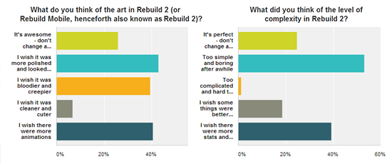
    My dubious hobby/addiction to making colorful graphs

    So the plan is to design an interface that fits snugly on 16:9 iPhone5s and wide PC screens, but scale and move around to fill more square screens. Here’s a few ways we might do it:

    Concept art for Rebuild 3 at 16:9 and 4:3
    Rebuild 3 concept menu
    Alternate concept with broken sliding hud
    Rebuild gui left menu concept
    Concept with menu down the left, taller menus.

    I hope my addiction to mockups leads to something useful. Adam’s doing the same thing on his end, finding inventive new ways to convey a ton of information without looking cluttered. I want the game to feel natural at any resolution, so you don’t feel so much like you’re buried in an endless stack of menus. Which… come to think of it, is not a totally inaccurate description of the game.

  • Rebuild 3: First look concept art

    Rebuild 3 logo

    After an exhaustive search for a Rebuild 3 artist, sifting through 150 applicants and agonizing over the decision for months, I chose the art and style of Adam Meyer (of Steamroller Studios and Crystal Clear Art). When he’s not working with me on Rebuild 3, Adam’s got a zombie game of his own on the go – the beautiful Deadwood with a super unique art style involving wooden people.

    As for the style of Rebuild 3 (tentatively called “Gangs of Deadsville”), we’re going to go for something cleaner and more cartoony than Rebuild 2… but not nearly as cheesy as my stickmen from Rebuild 1. Here’s a rough mockup of what we have in mind:

    Rebuild 3 concept mockup
    Adam’s mockup for the new look to Rebuild 3.

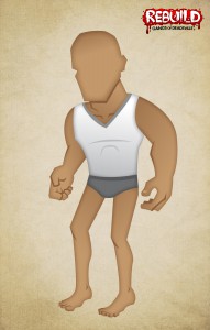
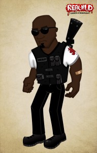
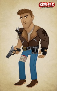
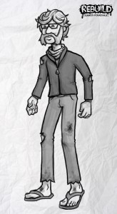
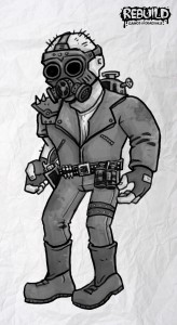
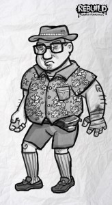
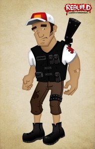
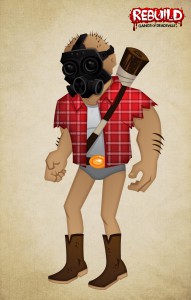
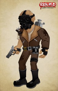
    The new characters have so much… character! They’ll have mix & match features like earlier games, and a bunch of new clothing options. Hipsters, geeks, cops and cowboys – I can’t wait to make my last stand with these adorable bastards. I’ll leave you with some of Adam’s survivor sketches:

    RogueSheriffGood Natured
    HipsterMilitiaPunk