A couple weeks ago I posted looking-for-artist requests on Newgrounds, DeviantArt, TIGSource and FlashGameLicense, and got a couple dozen responses. I was kind of expecting more, seeing as it was a paid contract to work on the sequel to a popular game, and I was surprised at how many of the responders hadn’t even looked at the original game. I did however get a few very exciting responses from people who had played the game and were – bonus – great artists.

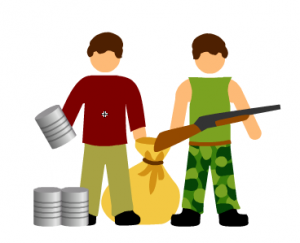
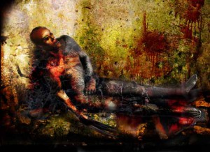
I chose EvilKris, creator of the Insanity and Insanity 2 point and click horror games. He works with 3D models and layers of texture to produce some truly dark, creepy images, far more realistic and disturbing than my clean and cutesy vector art from the first game.

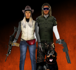
To start with he’s been working on characters and equipment to replace the old faceless stick figures, so you can really see the fear in your scavenger’s eyes as you equip her with a pistol and send her off alone to desperately scrounge for food at an Allmart teeming with the living dead.
Next will be the gory stuff for the zombie attack sequence, which I’ve decided is not going to be a minigame after all. I’m going to spend more time instead expanding the strategic game, adding plot and NPCs, equipment resources, new buildings and new endings. I hope the sequel will have more replayability, but one thing is for certain: it’s going to have a more a darker more engrossing (and also more gross) visual style, which will fit better with the storyline.
In other news, I recently did an email interview with Ethan Moses of HorribleNight.com where I talked a little about my inspiration for the game and the relative merits of zombies vs hive-minded insect aliens.


Comments
22 responses to “Rebuild 2: let’s get this arty started”
Not wanting to be a party pooper, but looking at these shots I think the more abstract original art looks better and more coherent than the generic attempt at photo real.
The new characters are clearly made up of lots of bits of different art, and those bits don’t gel together – different pixel densities, too hard edges where things join (look at the hands holding the guns, or the glasses on the guy), etc.
It’s probably just a personal preference. I thought the cartoony gfx of rebuild helped give it charm and allowed me to use my imagination to fill in the gaps more.
Completely agreeing!
(reply to this to this reply to show your support to original art!)
(Use the same text over and over by copying, replying and pasting!)
Otherwise, awesome game!
I’d have to agree with that comment. Photorealistic can fall on it’s face if it isn’t absolute, so a slightly more artsy style for this might work better.
Though, if you want to go with that style none the less, I’d say it’s wiser to go with a generic, detailed picture and make a lot of them rather than making a neutral stance and putting stuff on them. A soldier would sit with their rifle in hand, looking quit aggressive, a scavenger might look cautious, etc.
Or perhaps, you could make the weapons and such separate so you have more freedom with a “neutral’ stance.
Also, not sure if you care, but the firearms so far don’t look too great. Woman on left is holding the weapon by the magazine, and the guy on right isn’t even holding a real gun. Not trying to be an ass, but I figure it’s worth pointing out stuff before too much is invested into any given subject.
BTW: Can you check your newgrounds inbox? I replied to your message.
Holy crap I’m so excited! When do you think the game’s going to come out?!
I agree with everything FreakyZoid wrote about the old art being better and giving the original Rebuild much of its charm.
Personally, I HATE zombie movies. So for me, the cartoony art of Rebuild was part of the appeal.
I was hoping the sequel’s art would be more detailed and more refined, but still invoke the feel of the original game. I would like to see facial features, tattered clothing, and different shapes for male and female characters. I do NOT want to see photorealistic shots of people being disemboweled.
You should check out another zombie game called “Road of the Dead” (http://www.kongregate.com/games/EvilDog/road-of-the-dead). That game’s art style would work very well for Rebuild 2. Everything is more detailed, and there is blood and guts. However, the art still has a bit of a cartoony style which keeps things from getting too gruesome.
The humor was a huge part of the charm for me. Little cutesy figures fighting cutesy zombies. I’d aim for that more than added darkness and gore – I personally avoid excessively dark games because they sour my mood. I’d never enjoyed a zombie game until yours!
Great game I look forward to the sequel. Don’t think a darker look would hurt the game, the art from Insanity looks interesting. So long as the basics of gameplay stay true to the original, Rebuild 2 will be wonderful :)
It looks like you’ll get a much different audience for Rebuild 2 if you go with dark, gory graphics. The charming, simple drawings from the original game abstract away the horror associated with zombies and set a cheery, lighthearted tone for the game’s quirky humor. It all depends on how a subject is treated. For instance, not everyone who enjoyed “Zombieland” would care for “The Walking Dead”. (They’re two very-different approaches to the same theme.)
Maybe you’re embarrassed by the nondescript stick figures, but their charm stems from their simpleness and colorfulness. Personally, I’d prefer to see incremental improvements to the graphics, gameplay, and UI. (However, maybe I’m not part of your target audience for Rebuild 2…)
To be honest, I don’t mind whatever the graphics are in the game. What truly made the game fun and interesting out of the bunch was the gameplay; which will hopefully be transferred and improved in the next game. I’m sure that new players wouldn’t mind the art much but they’re looking forward to more features in the game.
I think the change in tone in terms of graphics will better project the theme that Sarah is trying to portray. While the simplistic illustrations did help to keep things light, the evolution of the game needs to embody the horror that would come as a result of a societal breakdown.
For those of us using Rebuild as a survival model for the potential undead apocalypse, kid friendly imagery would be counter productive to the mental conditioning it will take to make the hard choices needed for the continued existence of the human race.
I want to see a zombie colinnnn….
braiiiiins…..
Zombie eat brains but zombie cannot swallow this injustice XD
Just a couple of suggestions I just thought up:
A. Instead of just gathering food, can’t you gather other supplies as well? Make builders being able to fortify squares into having bonuses in areas like defense, food production or faster research than other labs.
B. Being able to scavenge not only food but weapons and other materials for the above suggestion.
C. Being able to use different types of weapons, not just amounts like SMG/Shotgun/Assault rifles that have different combative advantages for different environments.
D. Each square having an “environment” system that makes the survivor venture through narrower streets, wider spaces or places with a lot of debris that can either make them more insecure or easier because they have the right weapon for the right time.
I agree, this game was super popular because, while relatively simplistic, it integrated a strategy, which doesn’t have a lot of horror fans, and zombies, which are fun for generic fighting game fans. I’m not saying don’t make it less simple, just don’t throw blood on the walls and have someone’s eye torn out on screen. Give them an eyepatch, but don’t leave the eye on the floor. Besides that, the art was fine, and aside from extended plots and a bit more customization, it was an EPIC GAME
I’m kind of with some of the others here. The cartoony-ness of the art in Rebuild was kind of charming in a way.
But in either case, the strength of the game was doing something that hasn’t been done to death; a rebuilding-after-the-apocolypse strategy game. There are a lot of shooters and RPGs with variations on that theme (arguably Fort Zombie is playing to it on a smaller scale) but when I asked around, the last time someone could even come up with something like it was the old PC game Burntime, and that’s both old and pretty obscure.
I’ve got to say what I’d like to see is just a bit more depth to the game; as someone above said, search for more than food; have occasional finds that provide bonuses to some task or another for a turn or two: let people actually search for more dogs, and let the dogs add some to the defense; and so on.
Is the game still in development? I hope I am not too late to jump in discussion!
If you read the comments in Kongregate (where I first played Rebuild), many people suggest an easier selection of soldiers and putting idle people on defense.
Secondly, definitely more infrastructure, and infrastructures with more use! Someone suggested that warehouses should increase food cap. I also thinks that there should be a library, maybe to decrease research and build time. Maybe some people are entertainers (artists, musician) and they can be placed in a bar instead of using 2 leaders every time to keep people happy.
Since there were so many pets in the last game, maybe there should be a function to train them so that they can help cripple zombies? also a pet counter. maybe every n (like 5?) dogs add 1 to food restraint.
Since I play from Kongregate, I am sure the comments section has a lot of ideas floating around.
and more random events please. after playing a while it is quite possible to remember every single event.
The biggest frustration with Rebuild, and the thing that affected the replayability the worst, wasn’t the lack of variety of the limited graphics, but the occasionally-crappy user interface. The strategy side was extremely well-balanced, and had the level of complexity about right (a slightly more complex gameplay would add some more challenge and variety, but any overkill on that could easily kill the game by making the learning curve too steep or throwing the game-balance).
Assign all/none was buggy (defense stats on the main screen didn’t update although they did on the full city information display)
Defensive duties were a pain to administer. Having a core list of units assigned to guard duty makes sense; but other units unassigned at the end of the turn ought to count towards defence too. (Alternatively you could treat them as “hiding”, which could give them a much lower probability of being killed in an attack. Perhaps you could even have “hide” an assignable mission!)
Missions underway had a single icon; variants for recruit/scavenge/reclaim/rebuild would have been helpful.
Icons for food/survivors/”?” for buildings outside of control should probably have been switched on by default, rather than only activated by mouse hovering over the building (or the food/population icons at the top). There was room to display food AND survivor icons rather than only one at a time. Perhaps other players would disagree with me, but there should at least have been an option for that in the game settings.
Scrolling the population list made it clear which units were assigned or free, but not what they were doing. It should have been possible to click on a unit and be taken straight to their mission details window (or the guard roster if they’re on defensive duties) – this was a big frustration as there were many times that I was playing a game of “where did I put my leader/builder” etc…
When first clicking on a grid square where a mission is underway, it’s necessary to click on “Details” to get the full mission details, in order to cancel it. That’s often unnecessary – most times I know I need to cancel a mission without seeing the success stats and the unit roster. Why not have buttons for “Details” and “Cancel mission” on the window for the grid square? That would hardly be an overloaded menu.
In general I found I was having to click through more menus in order to do relatively simple things, than I wanted to. E.g. suppose 3 soldiers are in training at a school with 2 turns to go, but I just captured City Hall and now want leaders instead. Why do I have to select school, select the training mission, cancel it, start a leader-training mission, and then find my 3 survivors again on the roster. Why can’t I just click on the school, select the training mission, and change the training type to “Leaders” instead of “Soldiers”, get a warning message saying this will reset the training and it will take 3 more turns to complete, and press OK?
The only element of the gameplay that strikes me as a bug is the way it’s possible to clear a zombie square I don’t intend to capture, and just keep it clear by continually assigning and then next turn cancelling and reassigning missions. It seems that when a mission is underway at the end of a turn, no zombies move into or spawn into that square (zombie hordes excepted). This is a big flaw as it allows players to create buffers around their base. The simple solution would be to allow zombies to travel into or spawn in mission squares, but to keep the mission success chance fixed at the level it was when the mission was assigned. That way a player who initiates a mission before the zombies arrive is treated fairly, but someone who starts and then cancels a mission is correctly penalised.
Hi!
I got some thougts about rebuild 3…
(too excited to wait for after awhile since rebuild 2 launch.)
Title: Rebuild The World
Description:
Now your city is safe, it is time to reclaim the world! Fight over towns,cities,mountains,plains,farms,industry and even NAVAL BATTLES with mutated sea-zombies.
Also new are the teams. You dont use solitary survivors, no, they make up teams!
And limitless town. There’s a random square generator that creates surrounding squares as soon as you scouted another one. This way your city will be limitless. How many squares can you capture? Post it in the high score!
And then perhaps Rebuild the Universe???
may i beta test this game? thanks
by the way can i test this game
I don’t think is nescessary get the grafics better, the key of the game is the strategy