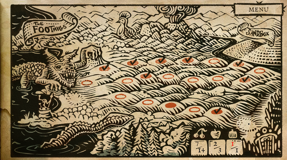
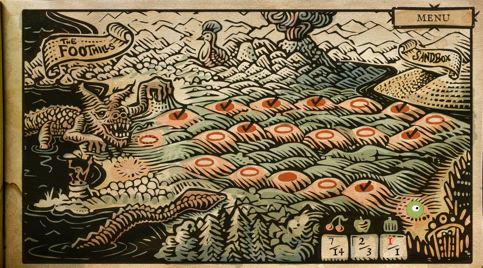
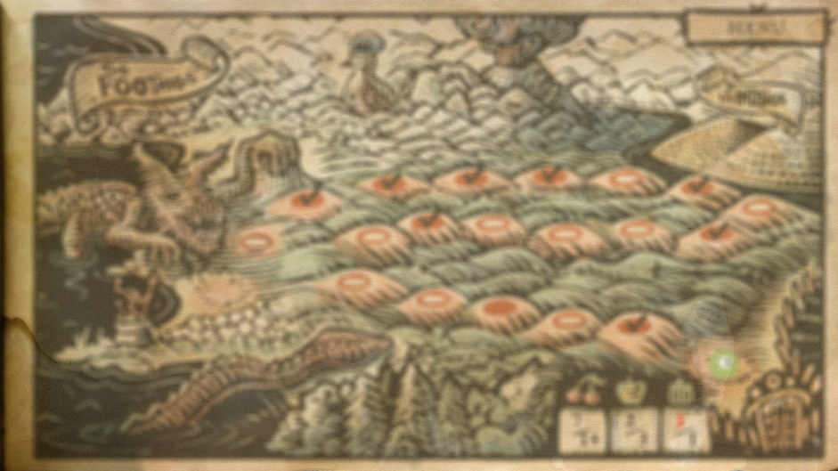
I wanted to do something nice in Incredipede for transitioning between screens. Instead of just flipping boringly from the title screen to the game map, for example, I wanted it to look like the ink was being pulled off the paper and then reprinted with a map. Like you could see the press pushing the ink into the paper.
You can see what I came up with by watching the begining of the video in my “How do You Play Incredipede” post.
I asked my friend at Gaijin Games, Andrew Hynek, who wrote an amazing looking ink game called Drift Sumi-e for some suggestions. I ended up mangling his ideas into something more me. That is, something simpler and easier to implement.
Incredipede is written in Flash using Stage3d. I use the Starling 2d API because it makes my code simpler and faster. One of the things I love about Stage3d is that I get to write shaders! In assembly! I find this really fun and I wrote a few posts on pixel shaders here.
This fade effect is all with the shaders. The basic idea is simple: I just take the brightest pixels and don’t draw them, then I take the next brightest pixels and stop drawing them until I’ve stopped drawing even the darkest pixels. The problem with doing that is it ends up looking kind of shitty. Here is how it looks if I just take out half of the brightest pixels:
Kind of awful. If you click to enlarge it you can see how individual pixels end up being pulled out of solid spots of colour. The fade ends up looking super pixely, like something from the 80s. Another problem is that all the black pixels just disappear all at once at the very end of the fade.
This is pretty bad but it was a good enough idea to start with. Sarah and I happened to be in Nice with our friend Marc ten Bosch while I was working on this and while we were all walking along an old aqueduct we discussed how to make it better. We thought about using noise to make the effect more organic but eventually came up with the genius idea to use a blurred mask.
The shader code to do the bad, pixely effect is something like:
//get the pixel
tex ft0, v0, fs1 <2d,repeat,linear,nomip>
//save a copy of the pixel in ft3
mov ft3, ft0
//brightness of a pixel ~= (R+R+B+G+G+G)/6
mov ft1 ft0.x
add ft1 ft1 ft0.x
add ft1 ft1 ft0.y
add ft1 ft1 ft0.y
add ft1 ft1 ft0.y
add ft1 ft1 ft0.z
div ft1 ft1 fc2
//ft1 now holds the pixel brightness
//if the brightness is less than our fade constant (which moves between 0 and 1)
//then make ft1 = 0, otherwise make it = 1
sge ft1, fc0, ft1
//multiply the saved pixel by ft1, which will zero it out if it isn’t
//darker than our fade constant
mul oc, ft3, ft1
Even if you don’t know agal assembly this shouldn’t be too hard to read. Most of the code is getting perceived brightness of the pixel with a formula from some friendly people over on Stack Overflow. All it does is take the brightness, check to see if it’s greater than our fade constant and doesn’t draw the pixel if it is.
Now, here is the clever trick that makes it look good. Instead of looking at the pixel in the image I look at the pixel of a blurred version of the image. I still draw the pixel of the normal unblurry image but I use a blurred image to decide whether to draw it or not.
Here’s what the image looks like not faded at all (wonder at the amazing art of Thomas Shahan!):
And here’s what the blurred image looks like:
Now, the player never sees this blurred image, only the graphics card does. We use the pixels from this blurred image to decide what pixels to draw from the unblurred image. Only one line of the shader code has to change. We used to do this:
//get the pixel
tex ft0, v0, fs1 <2d,repeat,linear,nomip>
//save a copy of the pixel in ft3
mov ft3, ft0
Now we do this:
//grab the pixel from the blurry image to check the brightness
tex ft0, v0, fs1 <2d,repeat,linear,nomip>
//grab the pixel from the unblurred image to actually draw
tex ft3, v0, fs0 <2d,repeat,linear,nomip>
We pass both images into the shader and use one as a mask to draw the other. This gives us beautiful unpixely fades that look like this:
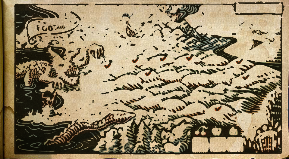
So that’s how the Incredipede ink fade is done. I admit that there is a little hand-waving magic here. You have to know how to render-to-texture and write custom shaders in Starling. Which is not terribly easy. And you have to be able to blur your image on the fly. The blurring is actually way harder than the ink-fade transition. I based my blurring on the work of Lars Gerckens.
Mostly I hope this inspired you to try some cool shader tricks of your own! They are pretty fun and you can get some great effects.
This example is taken from my game Incredipede, if you don’t already know what Incredipede is you can head over to Incredipede.com to check it out.

Comments
23 responses to “An Ink-Bleed Fade”
This is inspiring, thanks for sharing.
I’m a Flash dev addict but I’ve been dragging my feet on diving into Stage3D… this is making me realize some of the reasons I should really pick it up.
Wow, Thomas’ work is amazing, and the way you integrated into the game is awesome!
Nice effect, but why do you have to blur the image on the fly? If it’s a static art asset, it would be much more efficient to just blur it beforehand.
Obviously, you don’t want to waste memory loading a completely separate texture so you could just store a greyscale copy of the blurred map inside the alpha channel of the main map image (which doesn’t look like it’s being used).
Texture lookups in a shader are expensive so this would save you all the ones you need to blur the image as well as the second texture lookup to sample from a separate blur texture.
Additionally, this would allow your artist to customize the fade animation. For example, blurring the image and then applying gradient (with “multiply” blending) would make the image be drawn in with a direction that follows the gradient (i.e. left to right, from center, etc) which could be customized for each art asset you want to use the effect on. Or manually trace the lines with a gradient brush and the image will fade in like it’s being drawn.
Sorry for the novel, but hopefully that made sense. I’m just a graphics/digital art guy who happened to stumble on your blog and thought your art design for this game pretty great. Keep up the good work.
Yes you could definitely do this differently if you don’t need to do it on the fly. I fade into my levels which will have player’s creatures in them so I have to do it on the fly.
[…] […]
Seems like u truly understand very much about this particular
subject matter and it all exhibits thru this
particular blog post, called “NORTHWAY Games
… [Trackback]
[…] Information on that Topic: northwaygames.com/an-ink-bleed-fade/ […]
… [Trackback]
[…] Here you can find 76076 more Info on that Topic: northwaygames.com/an-ink-bleed-fade/ […]
… [Trackback]
[…] Read More Info here to that Topic: northwaygames.com/an-ink-bleed-fade/ […]
… [Trackback]
[…] Read More on on that Topic: northwaygames.com/an-ink-bleed-fade/ […]
… [Trackback]
[…] Find More on to that Topic: northwaygames.com/an-ink-bleed-fade/ […]
… [Trackback]
[…] Read More Info here to that Topic: northwaygames.com/an-ink-bleed-fade/ […]
… [Trackback]
[…] Info to that Topic: northwaygames.com/an-ink-bleed-fade/ […]
… [Trackback]
[…] Find More Info here on that Topic: northwaygames.com/an-ink-bleed-fade/ […]
… [Trackback]
[…] Info to that Topic: northwaygames.com/an-ink-bleed-fade/ […]
… [Trackback]
[…] There you can find 29682 additional Information on that Topic: northwaygames.com/an-ink-bleed-fade/ […]
… [Trackback]
[…] Find More Info here to that Topic: northwaygames.com/an-ink-bleed-fade/ […]
… [Trackback]
[…] Read More on to that Topic: northwaygames.com/an-ink-bleed-fade/ […]
… [Trackback]
[…] Here you can find 37148 more Information on that Topic: northwaygames.com/an-ink-bleed-fade/ […]
… [Trackback]
[…] Info on that Topic: northwaygames.com/an-ink-bleed-fade/ […]
… [Trackback]
[…] Read More here on that Topic: northwaygames.com/an-ink-bleed-fade/ […]
… [Trackback]
[…] Read More on that Topic: northwaygames.com/an-ink-bleed-fade/ […]
… [Trackback]
[…] Find More Information here to that Topic: northwaygames.com/an-ink-bleed-fade/ […]