Author: Colin Northway

  • An Ink-Bleed Fade

    I wanted to do something nice in Incredipede for transitioning between screens. Instead of just flipping boringly from the title screen to the game map, for example, I wanted it to look like the ink was being pulled off the paper and then reprinted with a map. Like you could see the press pushing the ink into the paper.

    You can see what I came up with by watching the begining of the video in my “How do You Play Incredipede” post.

    I asked my friend at Gaijin Games, Andrew Hynek, who wrote an amazing looking ink game called Drift Sumi-e for some suggestions. I ended up mangling his ideas into something more me. That is, something simpler and easier to implement.

    Incredipede is written in Flash using Stage3d. I use the Starling 2d API because it makes my code simpler and faster. One of the things I love about Stage3d is that I get to write shaders! In assembly! I find this really fun and I wrote a few posts on pixel shaders here.

    This fade effect is all with the shaders. The basic idea is simple: I just take the brightest pixels and don’t draw them, then I take the next brightest pixels and stop drawing them until I’ve stopped drawing even the darkest pixels. The problem with doing that is it ends up looking kind of shitty. Here is how it looks if I just take out half of the brightest pixels:

    Kind of awful. If you click to enlarge it you can see how individual pixels end up being pulled out of solid spots of colour. The fade ends up looking super pixely, like something from the 80s. Another problem is that all the black pixels just disappear all at once at the very end of the fade.

    This is pretty bad but it was a good enough idea to start with. Sarah and I happened to be in Nice with our friend Marc ten Bosch while I was working on this and while we were all walking along an old aqueduct we discussed how to make it better. We thought about using noise to make the effect more organic but eventually came up with the genius idea to use a blurred mask.

    The shader code to do the bad, pixely effect is something like:

    //get the pixel
    tex ft0, v0, fs1 <2d,repeat,linear,nomip>
    //save a copy of the pixel in ft3
    mov ft3, ft0

    //brightness of a pixel ~= (R+R+B+G+G+G)/6
    mov ft1 ft0.x
    add ft1 ft1 ft0.x
    add ft1 ft1 ft0.y
    add ft1 ft1 ft0.y
    add ft1 ft1 ft0.y
    add ft1 ft1 ft0.z
    div ft1 ft1 fc2
    //ft1 now holds the pixel brightness

    //if the brightness is less than our fade constant (which moves between 0 and 1)
    //then make ft1 = 0, otherwise make it = 1
    sge ft1, fc0, ft1

    //multiply the saved pixel by ft1, which will zero it out if it isn’t
    //darker than our fade constant
    mul oc, ft3, ft1

    Even if you don’t know agal assembly this shouldn’t be too hard to read. Most of the code is getting perceived brightness of the pixel with a formula from some friendly people over on Stack Overflow. All it does is take the brightness, check to see if it’s greater than our fade constant and doesn’t draw the pixel if it is.

    Now, here is the clever trick that makes it look good. Instead of looking at the pixel in the image I look at the pixel of a blurred version of the image. I still draw the pixel of the normal unblurry image but I use a blurred image to decide whether to draw it or not.

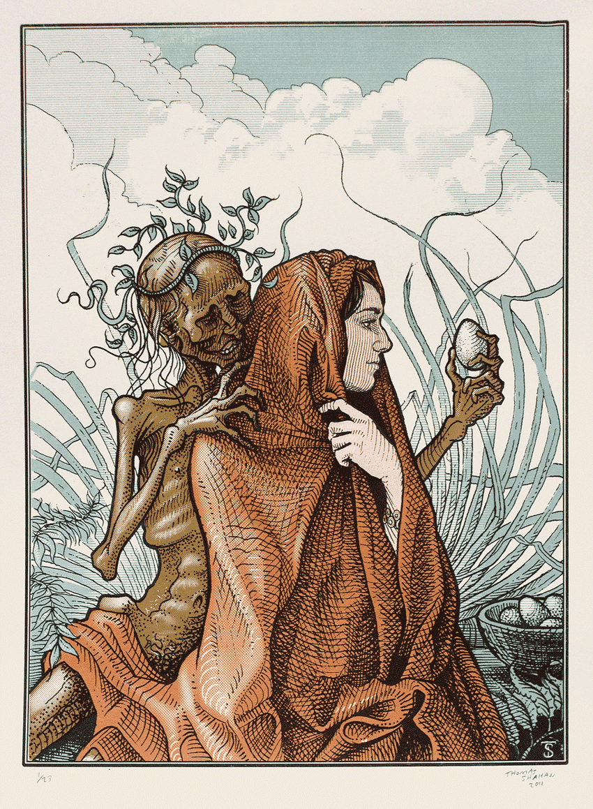
    Here’s what the image looks like not faded at all (wonder at the amazing art of Thomas Shahan!):

    And here’s what the blurred image looks like:

    Now, the player never sees this blurred image, only the graphics card does. We use the pixels from this blurred image to decide what pixels to draw from the unblurred image. Only one line of the shader code has to change. We used to do this:

    //get the pixel
    tex ft0, v0, fs1 <2d,repeat,linear,nomip>
    //save a copy of the pixel in ft3
    mov ft3, ft0

    Now we do this:

    //grab the pixel from the blurry image to check the brightness
    tex ft0, v0, fs1 <2d,repeat,linear,nomip>
    //grab the pixel from the unblurred image to actually draw
    tex ft3, v0, fs0 <2d,repeat,linear,nomip>

    We pass both images into the shader and use one as a mask to draw the other. This gives us beautiful unpixely fades that look like this:
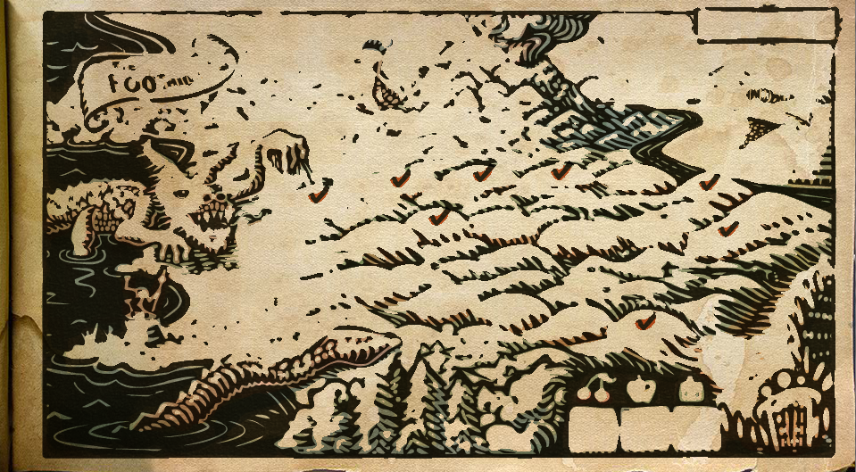
    The Map Half Faded

    So that’s how the Incredipede ink fade is done. I admit that there is a little hand-waving magic here. You have to know how to render-to-texture and write custom shaders in Starling. Which is not terribly easy. And you have to be able to blur your image on the fly. The blurring is actually way harder than the ink-fade transition. I based my blurring on the work of Lars Gerckens.

    Mostly I hope this inspired you to try some cool shader tricks of your own! They are pretty fun and you can get some great effects.

    This example is taken from my game Incredipede, if you don’t already know what Incredipede is you can head over to Incredipede.com to check it out.

  • How Do You Play Incredipede?

    Have you been wondering exactly how you play Incredipede? How do you make limbs? How many muscles can you create? Here are some answers for you.


    You can get more information about Incredipede as well as pre-order it at Incredipede.com.

  • Dear Proteus Parable

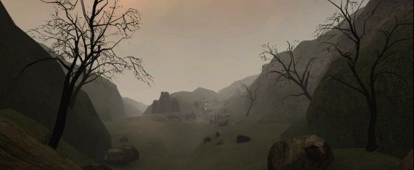
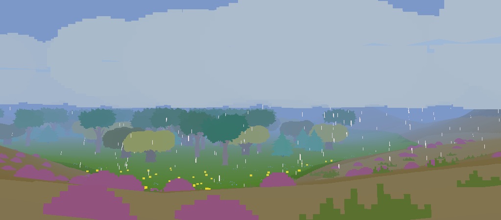
    Three games I’ve played or re-played recently got me thinking about Control.

    The Stanly Parable

    Dear Esther

    and Proteus

    These games all say something different about Control aka autonomy aka player agency aka whatever you want to call it.

    Every game lets you do different things. Some games are very opinionated about what you do, others less so. These three games all have something different but interesting to say about the Control they give you.

    It’s easy to love The Stanley Parable because it is satire. Satire about the very idea of player agency in games. The Stanley Parable says your Control is an illusion. Whatever you do, wherever you go, the developer had to go there first or the place wouldn’t exist. The nature of code means games have to be meticulously authored. At best games offer you a convincing lie.

    Into the world of the meticulously authored steps Dear Esther. Dear Esther makes no attempt to lie. Autonomy is not what Dear Esther is doing. It remove any meaningful Control from the game entirely. But by removing Control it gets to do something things other games don’t get to do. It gets to tell a linear story inside the gameplay. Dear Esther doesn’t have to be satisfied with tacked-on cutscenes or throw-away lines explaining some superfluous plot. The story melts into the visuals and the sound because there are no nasty choices to distract you from the pure sensory experience.

    I personally don’t like Dear Esther as much as the other two games. I spent a lot of my playthrough chafing against my lack of Control. But it successfully touches people and I love that it does.

    Proteus, on the other hand, is all about player agency. Proteus has very little interest in leading you by the nose. Little interest in showing you the best parts of its island realm. Little interest in ensuring an engaging experience. By letting go of the reigns it gets to do some things that other games don’t get to do. It gets to be pleasant place to be. With no real goal, no real systems to understand, and no story to tell it’s up to you to find something to do. It’s up to you to decide what will be fun or interesting. How much you want to explore, when you want to move on. I really like having all the power like this and Proteus provides an interesting enough world to reward the simple act of exploration.

    Choice and Control is what video games do that other mediums don’t. All three  of these games use this unique power in unusual ways. Proteus revels in the simple fact of it and Dear Esther harnesses it to deepen its tale, but The Stanley Parable certainly gets the last laugh.


  • Pulling at the Wet Strings of Life

    Jordan Fehr is Joining the Incredipede team as the game’s sound designer. I’m a big fan of his work. He’s done a great job on other games like Super Meat Boy, Snapshot, Jamestown and others.

    He asked me to describe my vision for the game. Which I haven’t really articulated here so I thought I’d share my response:

    If you haven’t watched my Sense of Wonder Night presentation start there. I talk about the birth of the game. At its heart it’s about life and the wonder of the variety of life.

    That’s why it’s set somewhere between the age of discovery in the 1600s and the Victorian era of the 1850s.

    That was a time when the world was still open and unfound. When exotic beasts and men existed in rumor and sketch. Imagine the feeling of possibility. Imagine what you could believe.

    The gameplay is about raw creation. The goals and levels only exist to goad you into creating. The point is to make something that you didn’t know existed. To delight yourself at your own creativity and ingenuity.

    That raw creativity is wrapped in the (metaphorical) language of nature, life, and exploration to give it vitality. Why fiddle with nuts and gears and bolts when you can pull at the wet strings of life?

    Colin

  • Incredipede Artist: Thomas Shahan

    Hello to you sirs and madames. I would like to introduce you to a talented young man by the name of Thomas Shahan.

    I found Thomas through a lucky turn of chance while I was perusing Wikipedia.

    Phidippus mystaceus by Thomas Shahan

    I was looking up jumping spiders while we were  in the Philippines because we had a lot of beautiful spiders running around. His astounding Phidippus Mystaceus picture caught my eye and I absent-mindedly decided to find out who had taken it. That brought me to ThomasShahan.com.

    Sterculia Nobilis by Berthe Hoola van Nooten

    I always wanted Incredipede to look like a Victorian illustration. While I was working on the game in Costa Rica I spent hours poring over old illustrated texts of botanists who had traveled to far off corners of the world.

    My favorite is Berthe Hoola van Nooten who traveled through Java and Surinam in the late 1800’s. Her work was lavish and colourful and her write-ups included rich details about how locals used the plants. She instilled the illustrations with a sense of the wider world. I can’t imagine how exciting it must have been to read her book in 1880.

    I was so taken with her work that originally Incredipede was in the form of a book. Each level had text on one side and a level on the other.

    So it was in this context that I discovered Th0mas’ illustrations.

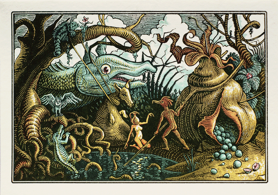
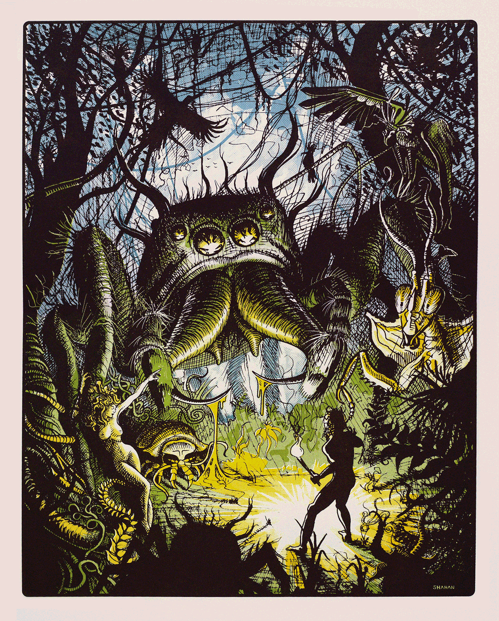
    Pond Gathering by Thomas Shahan

    Thomas’ woodblock cuts harken back to an earlier era than I was focused on. But his absolute reveling in the squishy fecundity of nature amazed me! His work has such a sense of place. It’s so disturbingly fascinating.

    Peregrinus by Thomas Shahan

    I sent him an email asking if he was free and possibly interested in working on a video game. It turns out he was just finishing art school and was interested. I sent him a screenshot of the game and he sent me a mock-up of the screenshot as it might appear with his art. I was blown away by the result.

    It turns out he’s also a pretty big video game nerd. When we started corrosponding he sent me a link to an old Genesis shooter called Bio-Hazard Battle which has a nice organic feel. I’ve also seen him go toe to toe with Alex Neuse in an Atari nostalgia-off. Which makes no real sense since Thomas is way too young to have played any Atari games.

    The Proposed Egg by Thomas Shahan

    A few weeks ago Thomas came out to San Francisco where Sarah and I are staying and we spent a solid week on the game together (although we did find time to go spider hunting in Golden Gate Park).

    So far he’s been doing an amazing job. I put together a secret game-play video and showed it around GDC and people went a little nuts for it.

    I’ll begin showing off his work in future posts. I don’t want to show you everything at once for fear of blowing your mind out through the top of your skull.

    Thomas at the SF MOMA