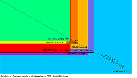
The target aspect ratio for Rebuild 3 is widescreen 16:9. Rebuild 1 and 2 were 4:3 which is pretty normal for Flash games that have to appear on sites like Kongregate with ads and stuff around them. But the PC/Mac and mobile versions of Rebuild 3 will support glorious fullscreen, where 16:9 is the new norm. Check it:
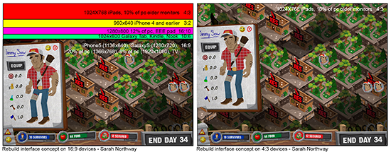
So the plan is to design an interface that fits snugly on 16:9 iPhone5s and wide PC screens, but scale and move around to fill more square screens. Here’s a few ways we might do it:
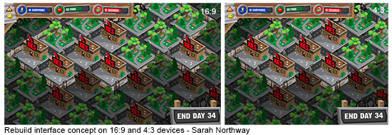
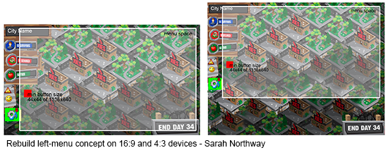
I hope my addiction to mockups leads to something useful. Adam’s doing the same thing on his end, finding inventive new ways to convey a ton of information without looking cluttered. I want the game to feel natural at any resolution, so you don’t feel so much like you’re buried in an endless stack of menus. Which… come to think of it, is not a totally inaccurate description of the game.

